Wednesday 23 January 2013

texture assignment - lamp


We did a floor lamp with 4 different surfaces and idea. The material that we used such as moderling board to be the 4sides of lamp, white paper for the building of morning, black paper for the building of night, trading paper as the top of the lamp and 2 bulb.

We have used the gestalt principle which is 
continuation- sunlight
alignment-illusion
 figure and ground-window of the building
 similarity- building.

The morning and night view represented the beauty of our city and also represented the way of human destroy nature to get a better life. Illusion represented the contradiction of human between protector and destroyer to nature. Human wanted a better life but also to protect to the nature. 

Here the photo of our lamp ;)
morning view and the illusion beside.
 
When morning, the building will become white and the window will become dark because of the sun light.


night view and the illusion beside.
               
 When night, the building will become dark and the window will become bright as what we saw usually the night view of the city.


reflection of light from the buliding and illusion.
 I like the effect so much. It will change the whole feeling of the room and make the wall of room become more interesting.

Tuesday 22 January 2013

silhouette

silhouette is the image of a person, an object or scene represented as a solid shape of a single color, usually black, its edges matching the outline of the subject. The interior of a silhouette is basically featureless, and the whole is typically presented on a light background, usually white, or none at all. The silhouette differs from an outline which depicts the edge of an object in a linear form, while a silhouette appears as a solid shape. Silhouette images may be created in any visual artistic media.


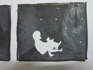
My silhouette.
here you go :)

It's a short story talking about..
In a gloomy night, the little boy had been abandoned by his parents to an orphanage. 

 He always get alone in the orphanage and slowly, the other orphans started to discriminate him.

 One day, he ran out from the orphanage but there was a heavy rain.

He found a place to avoid the rain.

He saw a box.

And there is a little dog came out.

 Start from that day, the dog has became his only friend.

 They always play together.

Enjoy the beautiful landscapes and scenes.

 Having every meal together.

 But sometime, he will miss those time with his family.

 One day, he saw a paper on the street light with a phone number, finding a lost dog.

 He knows that the owner of the little dog is finding it.

He give a call to its owner.

 They come and take back his only 'friend'.

 He felt sad but he wanted the little dog to stay with its family and live happily.

 When he wanted to walk away, the owner of the dog stopped him.

The parents agree to adopt him and finally, he has a new family and wont be alone any more.


Batik

Batik textile art of Malaysia, especially on the east coast of Malaysia which is KelantanTerengganu and Pahang. The most popular motifs are leaves and flowers. However, the butterfly theme is a common exception. The Malaysian batik is also famous for its geometrical designs, such as spirals.
Malaysia batik

 The method of Malaysian batik making is also quite different from those of Indonesian Javanese batik. The pattern of Malaysia batik is larger and more simpler, it seldom or never uses canting to create intricate patterns and rely heavily on brush painting method to apply colours on fabrics. The colours also tend to be lighter and more vibrant than deep coloured Javanese batik.
Indonesia - Javanese batik
I did one of the Malaysia batik in Jadi-batek which is a batik factory. 
The Harmonious Family

The elements that I have used on my batik are 3 birds, tree and red flower. The three birds is a family, they are standing on the brunch of the tree. Mother is standing on top; as father is standing on the bottom and the child is on the middle. Father is the person who has the responsible to his family in the way of money and the safety. Mother is standing on the top representing the image of the family.  She has the responsible to educate the character of her child. However, child is standing on the middle of her parents show the love and protection of her parents to her.  Bird is an animal that represents freedom. Therefore, they will usually fly away and would not care about their child’s safety after they grew up and learn how to fly. The drawing of a family bird is to represent the family love.
For the background of my batik is yellow color as it represents happiness of them. The bird father is standing on the bottom represented the responsible of a father to his family. Besides, the tree that I drew on my batik represented life. The way that human destroy nature have affect the animals as they will lost their shelter. In conclusion, we must use the right way to protect the animals.
The shade of yellow determines the meaning. Pure, bright and sunny yellow is the easiest color to see. People who are blind to other colors can usually see. It means joy and happiness too. Yellow daffodils are a symbol of unrequited love. Purple is the color of good judgment. It is the color of people seeking spiritual fulfillment. It is said if you surround yourself with purple you will have peace of mind. Purple is a good color to use in meditation. Purple is the color of good judgment which fulfills the characteristic of the mother. It is said if you surround yourself with purple you will have peace of mind.

Tessellation

Tessellation is the process of creating a two-dimensional plane using the repetition of a geometric shape with no overlaps and no gaps. It is seen throughout art history, from ancient architecture to modern art.

 Tessellations frequently appeared in the art of M. C. Escher, who was inspired by studying the Moorish use of symmetry in the Alhambra tiles during a visit in 1922.


Our lecturer Mr Charles had assigned us to do some tessellation by using gestalt principles. Which is similarity, proximity, continuation, closure, alignment and figure ground.


I had finished all the tessellation and here is the picture of my drawing.


closure - fruit

continuation - dance

figure ground - fish

alignment - aeroplane

similarity - sweet smell
proximity - fruit

that's all for my tessellation. TQ


Monday 12 November 2012

Design principles- paper cut out

Principles applied to the elements of design that bring them together into one design. How one applies these principles determines how successful a design may be.

All principles we assign to do with some square papers and use it to present the principles.


Rhythm

-may be generally defined as a "movement marked by the regulated succession of strong and weak elements, or of opposite or different conditions."


I cut out some arrow on the squares and your eye will follow the arrow from the first paper to the last. 


Movement


Movement is the path the viewer’s eye takes through the artwork, often to focal areas.


All the arrow is pointing to the same place and the focal areas will be the last arrow which is the smaller one.


Scale

-Using the relative size of elements against each other can attract attention to a focal point.

One sheep two sheep three sheep.. big to small make me fall to sleep.


Hierarchy

- A design contains elements that lead the reader through each element in order of its significance.

The emotion of me from the first class to the last class all the days.


Symmetrical balance

-generally conveys two primary meanings. The first is an imprecise sense of harmonious or aesthetically pleasing proportionality and balance, such that it reflects beauty or perfection.

swam lake. The fairy tales that everyone know.


Asymmetrical balance

-Asymmetrical produces an informal balance that is attention attracting and dynamic.

An owl family.
One side is heavy than another but still looks balance.


Repetition

-an instance of repeating or being repeated.

Many small hearts repeating and make it become a  big heart shape.


Dominance

- created by contrasting size, positioning, colour, style, or shape.The focal point should dominate the design with scale and contrast without sacrificing the unity of the whole.

What you see the first is the big big yellow square. Am i right? 

Sunday 11 November 2012

Steam punk

STEAM PUNK?
I know right.............I'm a very blur person.I spend almost 5 days to understand the meaning of steam punk. Research a lot of picture and get the definition from internet. But seriously, I cant really understand what is that. After did a lot of annoy to my friend, finally I get the answer. Thanks and sorry to my friends.

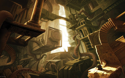
well, here is the definition of steam punk. Steam punk is a sub-genre of science fiction that typically features steam-powered machinery,especially in a setting inspired by industrialized Western civilization during the 19th century, or a post apocalyptic environment. 


some picture that inspire me 

Steampunk perhaps most recognizably features outdated technology or retro futurism inventions as people in the 19th century might have envisioned them, and is likewise rooted in the era's perspective on fashionculturearchitectural style, and art. Such technology can be found in the works of Jules Verne and H.G. wells, now best known for their work in the science fiction genre. They have been referred to as the " fathers for science fiction".


For the assignment of steam punk that given by Mr. Charles, I use line to draw the scenery instead of shape, point and form. Line is more easy for me to create the realistic of the drawing. What I drew is a clock shop. Clock represents life. The loss of time, day by day will make human growth. But in the other way, if human do not cherish the time, perhaps they will still stay in the same place.

Photo is quite blur cause I have no camera at the time. hmm.. Anyway, That's all for my steam punk assignment.