Monday, 12 November 2012

Design principles- paper cut out

Principles applied to the elements of design that bring them together into one design. How one applies these principles determines how successful a design may be.

All principles we assign to do with some square papers and use it to present the principles.


Rhythm

-may be generally defined as a "movement marked by the regulated succession of strong and weak elements, or of opposite or different conditions."


I cut out some arrow on the squares and your eye will follow the arrow from the first paper to the last. 


Movement


Movement is the path the viewer’s eye takes through the artwork, often to focal areas.


All the arrow is pointing to the same place and the focal areas will be the last arrow which is the smaller one.


Scale

-Using the relative size of elements against each other can attract attention to a focal point.

One sheep two sheep three sheep.. big to small make me fall to sleep.


Hierarchy

- A design contains elements that lead the reader through each element in order of its significance.

The emotion of me from the first class to the last class all the days.


Symmetrical balance

-generally conveys two primary meanings. The first is an imprecise sense of harmonious or aesthetically pleasing proportionality and balance, such that it reflects beauty or perfection.

swam lake. The fairy tales that everyone know.


Asymmetrical balance

-Asymmetrical produces an informal balance that is attention attracting and dynamic.

An owl family.
One side is heavy than another but still looks balance.


Repetition

-an instance of repeating or being repeated.

Many small hearts repeating and make it become a  big heart shape.


Dominance

- created by contrasting size, positioning, colour, style, or shape.The focal point should dominate the design with scale and contrast without sacrificing the unity of the whole.

What you see the first is the big big yellow square. Am i right? 

Sunday, 11 November 2012

Steam punk

STEAM PUNK?
I know right.............I'm a very blur person.I spend almost 5 days to understand the meaning of steam punk. Research a lot of picture and get the definition from internet. But seriously, I cant really understand what is that. After did a lot of annoy to my friend, finally I get the answer. Thanks and sorry to my friends.

well, here is the definition of steam punk. Steam punk is a sub-genre of science fiction that typically features steam-powered machinery,especially in a setting inspired by industrialized Western civilization during the 19th century, or a post apocalyptic environment. 


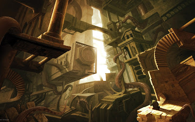
some picture that inspire me 

Steampunk perhaps most recognizably features outdated technology or retro futurism inventions as people in the 19th century might have envisioned them, and is likewise rooted in the era's perspective on fashionculturearchitectural style, and art. Such technology can be found in the works of Jules Verne and H.G. wells, now best known for their work in the science fiction genre. They have been referred to as the " fathers for science fiction".


For the assignment of steam punk that given by Mr. Charles, I use line to draw the scenery instead of shape, point and form. Line is more easy for me to create the realistic of the drawing. What I drew is a clock shop. Clock represents life. The loss of time, day by day will make human growth. But in the other way, if human do not cherish the time, perhaps they will still stay in the same place.

Photo is quite blur cause I have no camera at the time. hmm.. Anyway, That's all for my steam punk assignment.

Monday, 1 October 2012

2D design - self portrait

For the first class of 2D design, we were going to do our portrait which means using some natural materials to figure out our face.
Before doing this, I collected some natural materials from my house and also my friends such as:
  • green beans
  • red beans
  • satay stick
  • oatmeal
  • black glutinous rice
  • millet
  • flowers
  • leaves
  • feather

At the beginning, we have to sketch out our own portrait by referencing our picture. I used leaves, flowers and feather for my hair. Millet to trace out the face shape. Beside, I used red colour's fruit for my eyes to make the face looks sharper.


That's how the outcome look like compare with my own picture:


How I feel about my self portrait? It's kinda look like a girl who walks out from the lake, full of seaweed.hmm..and NAKED as well. 

Processing..


yayy :) done..